
A photograph in a football match that is not just a sport photograph
Necaxa vs. Puebla. A photograph about composition, perspective, and knowing when to leave things alone.
When you take a photograph like this, you don't have to say a word to anyone anymore. Because nobody can say a thing to you ever again.
And I took that photograph.
A league match in Mexico: Necaxa vs. Puebla. I was there on assignment for L'Équipe. The game itself was secondary to the job I had been asked to do. But I delivered on the pitch, too.
I passed the ball to a Necaxa player with a pretty sweet side-foot pass with my right foot.
And I took this photo.
The goalkeeper is the problem. And the solution.
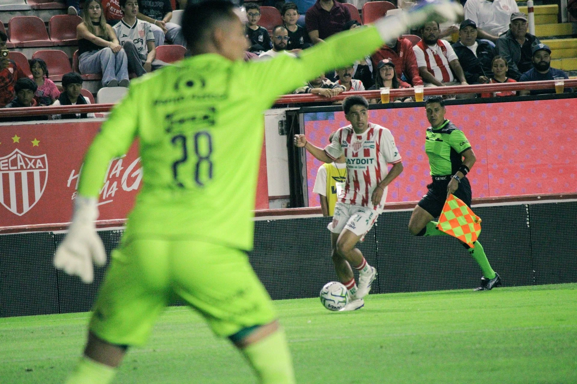
Let's start this analysis with the obvious thing. The goalkeeper is clearly out of focus. He occupies a huge portion of the frame, and his body obscures part of the scene. His raised arm cuts diagonally across the image, while his fluorescent green uniform dominates the foreground. If we were discussing this photograph in a conventional photography class, someone might suggest that the goalkeeper is distracting. Someone else might say I should have waited for a cleaner composition, moved a little to the side, or used a different focal length.
Perhaps.
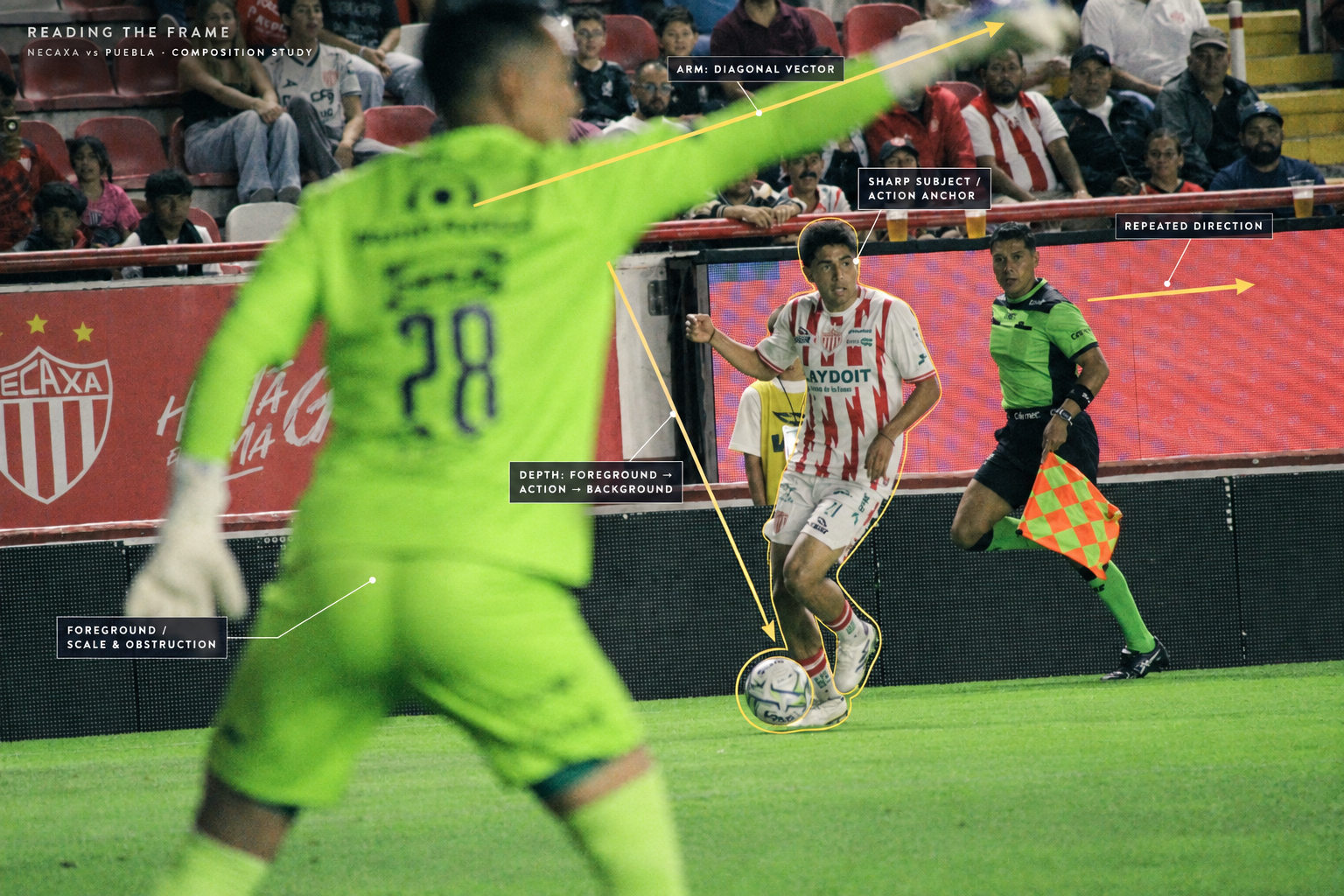
But why should I remove the very thing that makes this photograph interesting? I don’t think so. The goalkeeper here isn't simply an obstacle between the camera and the action. He is the element that gives the image its spatial structure. His blurred body establishes the foreground, creating an immediate sense of proximity. We are not looking at the action from a neutral distance. We are inside it, almost caught between the goalkeeper and the player approaching with the ball. The goalkeeper is also a visual counterweight to the Necaxa player. He is enormous, indistinct, and close to us. The player is smaller, sharper, and further away. Their relationship creates tension, and that tension is what holds the photograph together.
The foreground doesn't need to be sharp to be important. It needs to have a reason to be there.
A diagonal that connects the action
Look at the goalkeeper's raised arm. It travels from the left side of the image towards the upper right, creating one of the photograph's strongest directional lines. Now look at the assistant referee. He is running towards the right, carrying his flag, while the Necaxa player advances through the same general space. These directions don't form a neat geometric diagram. They don't need to. They create a visual movement that extends beyond the ball itself. The goalkeeper's arm points into the scene. The assistant referee's movement reinforces the direction of play. The Necaxa player becomes the point at which our attention settles, with the ball anchoring the action near the bottom of the frame.
There is a kind of visual conversation taking place between these elements. And none of it requires the familiar recipe of placing the main subject at an intersection of imaginary lines. The photograph works because the elements relate to one another, not because they obey a compositional formula.
This is the important distinction. Composition isn't a set of instructions we apply to reality. It is a relationship we recognise, sometimes intuitively, while reality is unfolding in front of us.
Three planes, one photograph
That is where we can see how much important is street photography in order to learn to see and being ready to capture a certain composition. The photograph has three distinct layers. Just like…I find myself often to realize my photographs on the street. 3 layers, 3 levels of reading.
The goalkeeper occupies the foreground. The Necaxa player and the ball form the principal action in the middle ground. The assistant referee, advertising boards, and spectators establish the background.
Yet these layers aren't isolated from one another.
The goalkeeper's arm crosses the space above the player. The player's body overlaps the bright advertising screen. The assistant referee runs behind him, close enough to become part of the same visual event. The background also matters more than we might initially think. The red seats, the spectators, and the Necaxa signage tell us where we are: it is the sense of place that to me as a documentary photographer is important. They establish the particular atmosphere of a Mexican football stadium without demanding that we examine every detail. It is not just a football match: it is the football match where I was assigned to go and making my job.
The photograph has depth because the different planes interact. Notice, too, that the foreground goalkeeper is blurred, but the background isn't uniformly sharp. The image distributes attention through differences in scale, focus, colour, and contrast. Our eyes move between these elements rather than settling exclusively on one perfectly isolated subject. It is a moving image.
And this is not the clean, clinical separation that contemporary image-making often tries to achieve. It is something messier and, to me, much more alive.
The importance of what isn't perfect
I like the fact that the goalkeeper is so conspicuous. I like the fluorescent green, the grain, the slight roughness of the image, and the way the action seems to be happening faster than the photograph can comfortably contain. The Necaxa player is in the middle of the fluorescent green. This isn't a photograph that tries to make football look beautiful in the conventional sense. It is a photograph about being there, in the right position, at a particular moment.
There is a difference between a technically controlled photograph and a photograph in which everything is under control. The first is a matter of technique. The second is an illusion.
Photography, especially when working in rapidly changing situations, requires us to accept a certain degree of uncertainty. We can anticipate, observe, and make decisions, but we cannot choreograph everything. Other people move. Objects enter the frame. Gestures appear and disappear. Sometimes the very thing that seems to be ruining a photograph becomes its most valuable element. We have to be able to recognise that possibility. And we have to be persons not rigid, availabl to accept the imponderable.
I am not suggesting that every blurred foreground or badly timed gesture automatically makes an image interesting. That would be nonsense. An imperfection is not a virtue in itself. It becomes meaningful when it contributes to the photograph. Here, the goalkeeper's blur establishes distance, scale, and tension. His arm creates a directional line. His body gives the action a physical presence. Remove him, and you remove much of what makes the photograph work. The same goes for the grain and the slightly unruly quality of the image. They belong to the photograph's character. I have no particular interest in making the frame look as if it were manufactured in a laboratory. In a time where AI is everywhere I want even more to offer imperfection.
You don't always need to see everything
One of the persistent misunderstandings about photography is that clarity must always be the objective. We are encouraged to make subjects stand out, eliminate distractions, separate foreground from background, and ensure that the viewer immediately understands what is happening. But photographs can also be built around partial visibility.
Here, the goalkeeper obscures the scene while simultaneously revealing its depth. The player's relationship with the ball is clear enough, but the photograph doesn't give us a perfectly unobstructed view of the match. We have to navigate the frame. That small effort matters in my opinion. We move from the goalkeeper's blurred body to his raised arm, then towards the Necaxa player, down to the ball, and back towards the assistant referee. The photograph gives us several points of entry rather than a single, neatly packaged answer.
I don't think every photograph needs to explain itself immediately. Sometimes, a little friction is precisely what makes us look longer.
A photograph doesn't need to justify itself
I took this photograph while working for L'Équipe. My assignment required me to deliver a specific body of work, and the match was part of that job. I was there to photograph, not to demonstrate a theory of composition. Yet this is exactly the kind of frame that reminds me why I keep photographing. You can study composition. You can read books, look at the work of other photographers, and learn to recognise visual relationships. All of that is useful. But eventually, you have to stand somewhere, look at what is happening, and make the photograph.
You have to trust your eyes. And you have to accept that the frame may be imperfect by conventional standards. You have to understand that the relationship between elements can matter more than the individual elements themselves. And sometimes, you have to trust a photograph before you can fully explain why it works. Looking at this frame now, I can talk about diagonals, depth, visual weight, colour, and the relationship between foreground and background. I can explain how the goalkeeper's blurred body gives structure to the scene, and how the other figures reinforce its movement. Of course is a day after speculation.
But I didn't need to recite any of those things when I pressed the shutter. I just saw the photograph, and I took it. Then I played a pretty decent pass with my right foot. Not a bad evening's work.
I hope this post makes sense for you. Let me in the commets what you think about this photograph. honestly so far I think that is my best photo made during a football match. Yes, I don’t need a goal or a more important moment. Here there is a lot of intentional, and I achieved to do it. That is why I love it.